Your Basket  0 items - £0.00
Differentiated Learning Objectives
Links to Lesson Resources (Members Only)
Students work out the mean, median and modal average from data presented in a frequency table. Students should have a good understanding of the modal average. Still, they may need guidance in calculating the median. The aim is to recap these static values to progress onto identifying trends later in the lesson.

Prompts / Questions to consider
Click here to view the video.
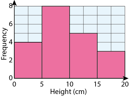
When drawing frequency diagrams, students need to understand the difference between continuous and discrete data. Discrete data can only take exact values. Continuous data can take any value and cannot be measured exactly.
A bar chart can be used to display grouped discrete data.

A histogram is used to display grouped continuous data.

Prompts / Questions to consider
Students compare distributions using two frequency polygons. Emphasise that it is essential that they justify their response using different segments of the frequency polygon. Students could work in pairs to question and convince each other. Then, have students peer assess by some groups sharing their reasoning with the rest of the class. This activity takes between 5 and 8 minutes.

Prompts / Questions to consider
More able students could be given a frequency polygon and asked to work backwards to estimate the mean average. Less able students may need to have the axes scale provided for them.
Engage and inspire your students while reducing your lesson planning with a Mr Mathematics membership.
Planes of Symmetry in 3D Shapes for Key Stage 3/GCSE students.
Use isometric paper for hands-on learning and enhanced understanding.
Master GCSE Math: Get key SOH-CAH-TOA tips, solve triangles accurately, and tackle area tasks. Ideal for students targeting grades 4-5.
Explore Regions in the Complex Plane with A-Level Further Maths: inequalities, Argand diagrams, and geometric interpretations.


