Curriculum Hub → Maths Lessons → Statistics → Representing Data → How to Interpret Box Plots (GCSE)
A box plot (also called a box and whisker plot or box and whisker diagram) is a way to display a set of data using five key values: the minimum, lower quartile (Q1), median, upper quartile (Q3) and maximum.
The box shows the middle 50% of the data (the interquartile range). The whiskers stretch out to the lowest and highest values. At GCSE, box plots are used to read averages and spread quickly, and to compare two or more data sets on the same scale.
Three for Key Stage 3, one for GCSE and two for A-Level. Presentation, worksheet and answers for each, plus one free resource every Monday.
Unsubscribe any time.
Watch how to read the five-number summary from a box and whisker diagram, find the median and interquartile range, and compare two data sets. Open on YouTube if you’d rather watch there.

GCSE-style questions on reading medians and interquartile ranges from box plots, then comparing distributions. Ideal for classwork, homework or revision. Full worked solutions included so teachers can project answers to the class.
This free worksheet is a start. School membership unlocks every representing-data lesson, ready-made presentations, differentiated worksheets and schemes of work for the whole department.
Example 1 – finding the median and IQR from one box plot.
A box plot shows the number of students at an after-school maths club each week. The lower quartile is 35, the median is 43 and the upper quartile is 71.
Example 2 – comparing two box plots.
Two box plots show weekly earnings for 21-year-old and 35-year-old employees. The 21-year-olds have median £180 and IQR £80. The 35-year-olds have median £240 and IQR £70.
Example 3 – using a quartile with a sample size.
A box plot for 80 hockey players has an upper quartile of 5.6 km. How many players ran more than 5.6 km?
Students can often read a median from a box plot, but they struggle to turn that into a clear comparison. They mix up range with interquartile range, or they describe a diagram without linking the comment to a value.
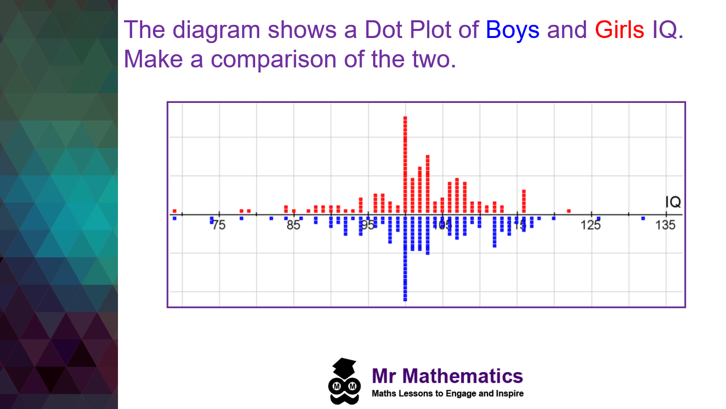
In this lesson I start with a familiar representation (a dual dot plot), then show why a box plot focuses attention on the median and the middle 50%. We then practise reading one diagram, comparing two diagrams, and writing exam-style comparison sentences.
If you are sequencing statistics across KS3 or GCSE, I line this up with other representing-data work via the Mr Mathematics Curriculum Hub and our mathematics schemes of work.
Ask students to work in pairs to compare boys’ and girls’ IQ from the dual dot plot. The goal is not a perfect statistical write-up yet. It is to notice that comparing two sets side by side is powerful, but the median and middle 50% are hard to see.
Prompts / Questions to consider
This is the core modelling I use when I want the class to see how a box plot summarises a distribution and how to compare two data sets. See the video near the top of this page, or open it on YouTube.
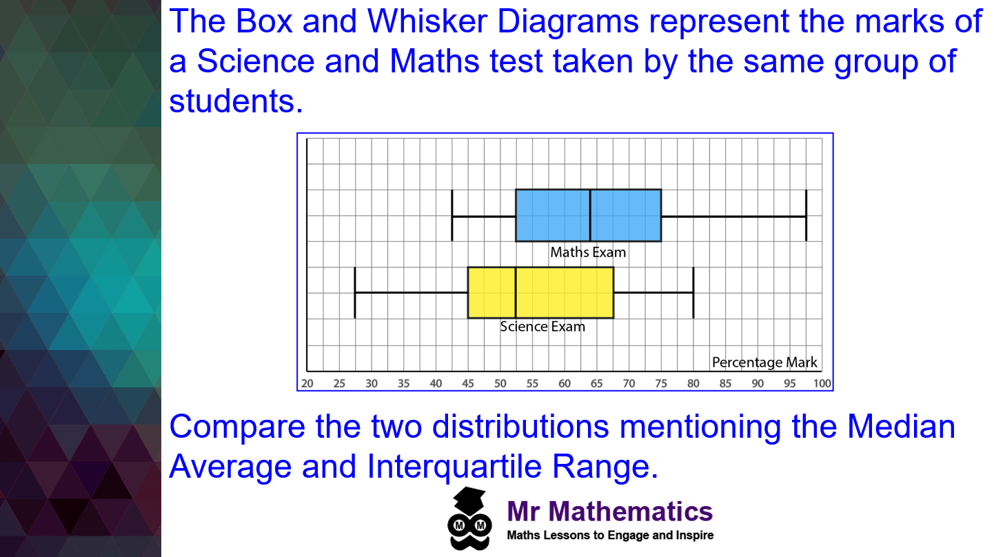
Progressing on from the dot plot, discuss how box and whisker diagrams are like aligned distributions on the same number line. One key difference is that box plots focus attention on the middle 50% of the data (the interquartile range) and show the median clearly.
After demonstrating the key features, pose the question below for students to work through in pairs.
Prompts / Questions to consider
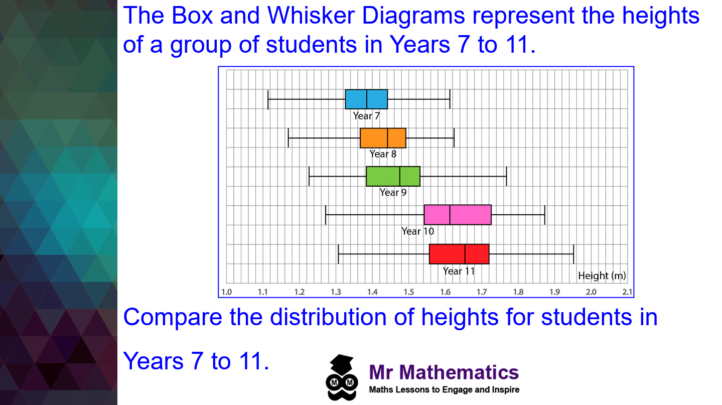
In the plenary, ask students to compare the distribution of heights for students in Years 7 to 11. Encourage them to share comparisons with peers so they refine and justify their reasoning.
Prompts / Questions to consider
These exam-style questions are designed for projection. Ask students to attempt each one, then reveal the worked solution.

a) Write down the median.
The median is shown by the vertical line inside the box.
Median = 43 students
b) Work out the interquartile range.
The interquartile range is the upper quartile minus the lower quartile:
IQR = Q3 − Q1
IQR = 71 − 35
IQR = 36 students

Step 1: Read the five-number summaries from the box plots
| Minimum | Lower quartile | Median | Upper quartile | Maximum | |
|---|---|---|---|---|---|
| Males | 10 | 36 | 50 | 76 | 100 |
| Females | 4 | 26 | 50 | 66 | 110 |
Step 2: Compare the averages (medians)
Median (males) = 50 and Median (females) = 50.
Step 3: Compare the spread
The median number of times the phone was used is the same for both groups (50), so on average there is no difference between male and female employees.
The interquartile ranges are also the same (40), showing equal spread in the middle 50%. However, the range is larger for the females (106 compared with 90), so the female employees’ results are more spread out overall.

a) Compare the distributions
Medians: £240 > £180 → the 35-year-olds earn more on average.
IQRs: 210 − 130 = £80 (21s) vs 280 − 210 = £70 (35s) → the 21-year-olds’ earnings are more spread out.
b) Estimate (minimal working)
£130 is the lower quartile for the 21-year-olds → 75% earn £130 or more.
0.75 × 200 = 150 employees

a) Interquartile range
IQR = 5.6 − 4.85 = 0.75 km
b) Players who ran more than 5.6 km
5.6 km is the upper quartile → 25% of the players ran further.
0.25 × 80 = 20 players
School membership gives your department full access to GCSE statistics lessons, exam-style questions and schemes of work – so every teacher can project consistent resources without rebuilding them each year.
Read the five-number summary, use the median to comment on the average, and use the interquartile range to comment on the spread of the middle 50% of the data.
Compare medians for which data set is higher on average, then compare IQRs (or ranges) for which set is more consistent or more spread out. Link each comment to a value from the diagram.
IQR = upper quartile − lower quartile. It is the width of the box and shows the spread of the middle half of the data.
A dot plot shows every individual value. A box plot summarises the distribution with the median, quartiles and extremes, which makes comparison of average and spread clearer.
Use this page for the teaching sequence, video and exam questions, download the free worksheet above, and explore the full representing-data pathway in the Representing Data lessons and Mr Mathematics membership.
Browse representing-data resources on the hub and pick the next lesson in your sequence – many departments follow box plots with cumulative frequency, histograms or GCSE statistics revision.
Build a complete and coherent teaching sequence with structured lessons, worksheets and question generators.
Teach this lesson with the video, free worksheet and projectable exam questions on this page.
Explore the Curriculum Hub to find lessons by topic and key stage.
Visit the GCSE Revision Hub for topic-based revision lessons.
Join Mr Mathematics for full access to all lessons, resources and schemes of work.


Students learn how to plot a box and whisker diagram.
Later, as learning progresses, they interpret box and whisker diagrams to compare distributions.


Students gain additional practice drawing and interpreting box and whisker diagrams.
The problem-solving activity challenges students to complete a table of results, plot the box diagram and interpret the results.
A research-backed case exploring why over-reliance on automated math homework platforms and repetitive worksheets lowers student expectations, and how departments can build genuine mathematical thinking.
How to teach converting between fractions, decimals and percentages.
Four problem solving lessons to develop student’s mathematical reasoning and communication skills.
